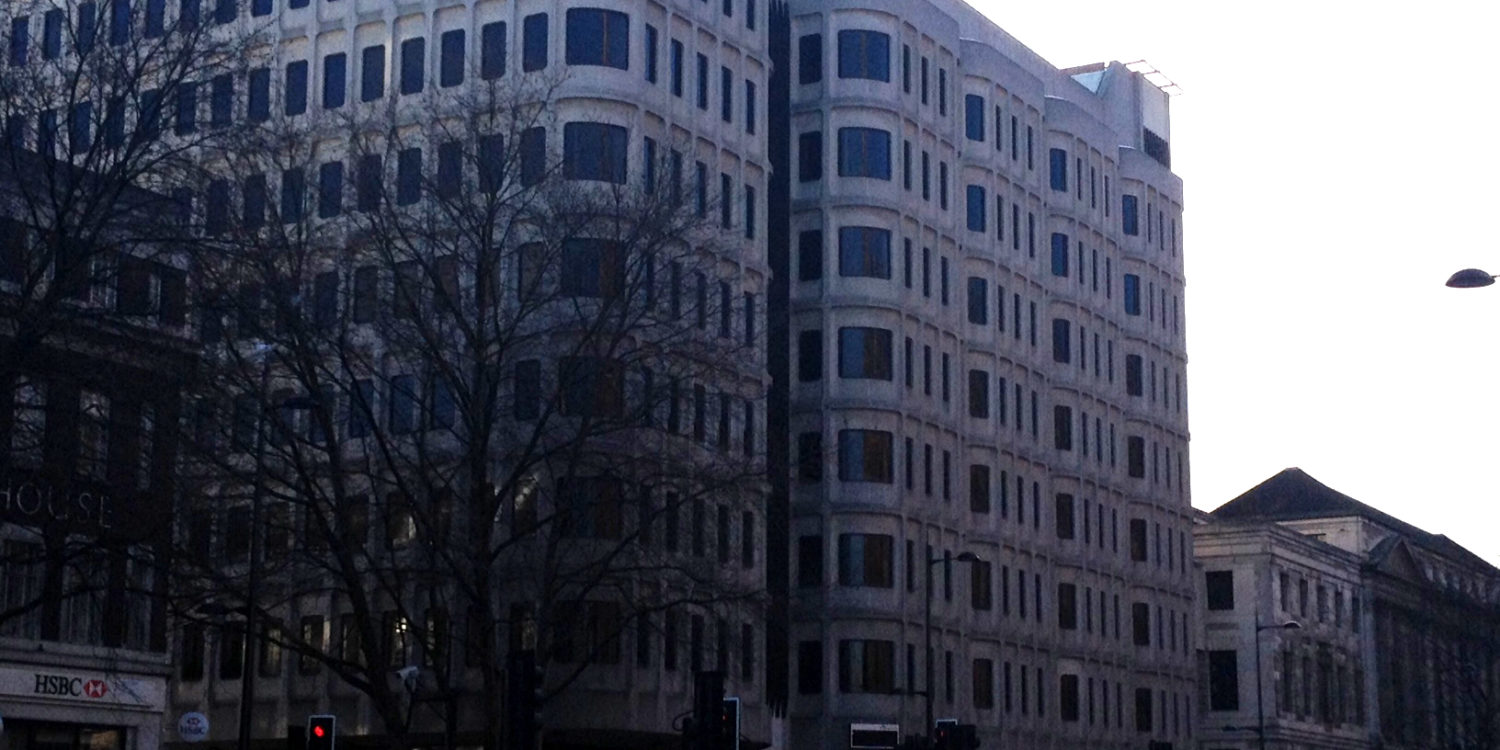
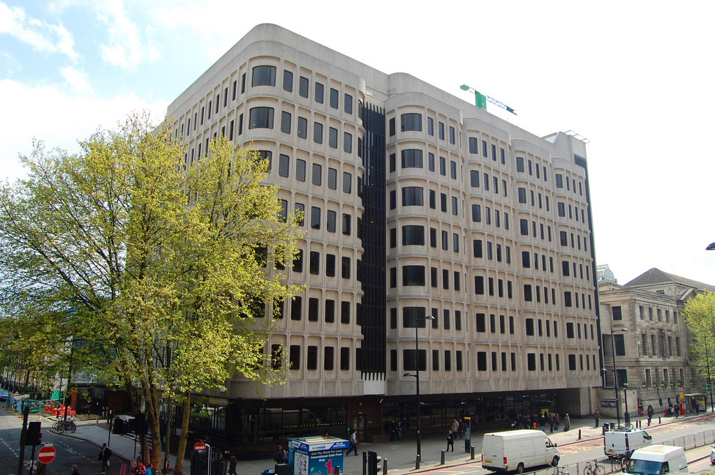
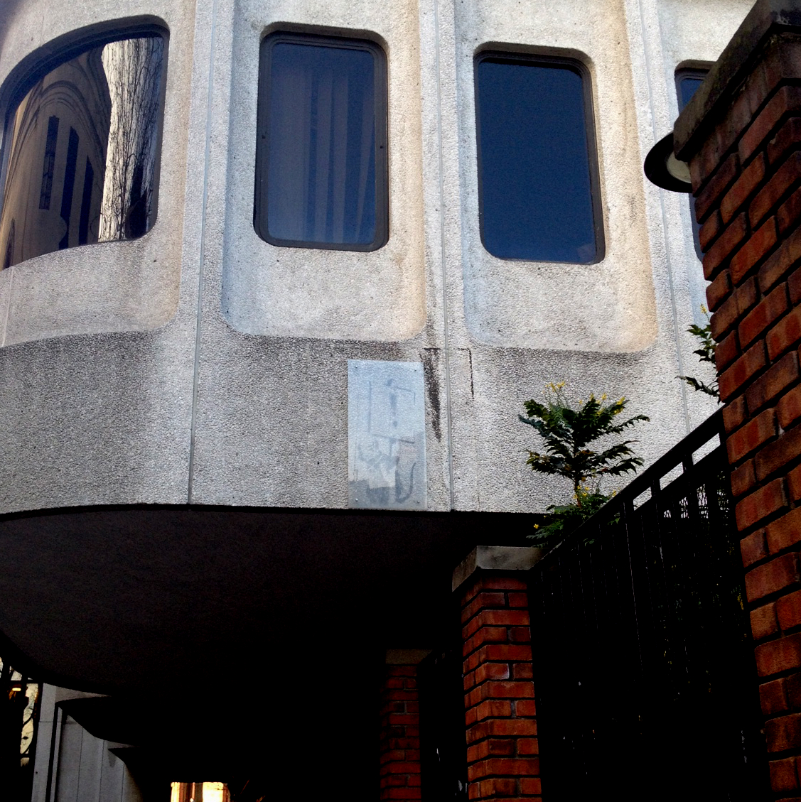
Across from George Gilbert Scott’s St. Pancras Building is a mass of muddled grey that in the perpetual early-November weather of London may go completely ignored: all brown tint and bubble concrete. This body, with its public entrance on a side street, is the Camden Council Office Building.
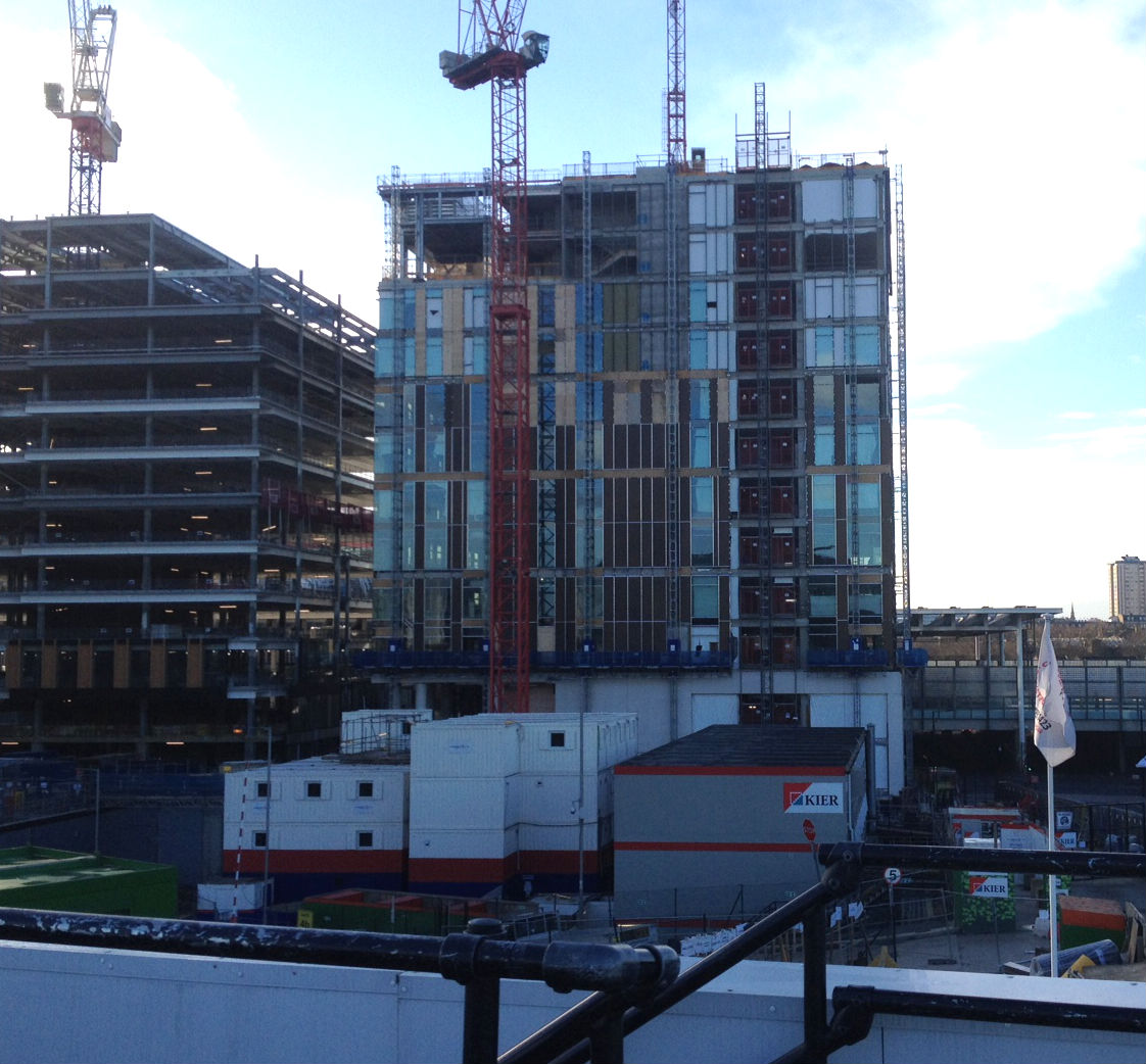
It’s not an entirely welcoming place, particularly as according to local London architects security restrictions from the 2000s made the upper floors inaccessible to the public. Indeed movement from the entrance to the waiting rooms is a herd-like shuffle of administrative inevitability. All in all, the experience is unapproachable and indifferent, but almost as a metaphor for public service, brimming with expectation and dutiful intentions. However within a minutes’ walk, just behind King’s Cross Train Station, is this building’s usurper: the new Camden Council Office (set to be complete in 2014).
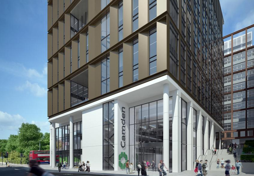
The new structure’s proposed and gathering form is vaguely similar to the Council’s current home, except with sustainable-esque overhangs instead of curved concrete. Perhaps an exchange in banalities, but one that is contemporary in aesthetics and moral leanings.
Yet, beyond the aesthetics is a specific and growing architectural discourse, because what the new Camden Council Office Building does and represents is a serious question. Not just for Camden but for the perceptions of governmental duty in a digital age.
Misty Water Cooler Memories
As an architectural typology, smaller administrative facilities have the worst of two worlds. For funding reasons, they need to be up-to-the-minute examples of technological advancement but must also serve as a timeless, multi-generational hub of symbolism. So constituting the failure of such a building is a complex question. Is their failure a result of poor planning, or is it simply easier to blame the past to fund the future? The answer, if there is one, can be found in politics best friend and worst enemy, perception.
When looking at the new Council Office, there is a desire to look for a popular precedent, the most notable being the ‘Old Town Halls‘ of London. These Victorian structures represent the era’s paternalistic relationship between power and public: patronizing, but also somehow comforting. Though when comparing pre-war town halls and post-war council offices, there is a noticeable change in administrative thought (shown mostly by the latter’s lack of public gathering space and noticeable entrances). The structures of the post-war have a very different understanding of its duties, changing the focus from charity to obligation, particularly in perception. For example:
1895
“The present evils of city life are temporary and remediable. The abolition of the slums, and the destruction of their virus of feasible…if one uses the term City Government in the large sense that makes it inclusive of this entire ordering of the general affairs and interests of the community.” – Albert Shaw, 1895 (as referenced by Ebenezer Howard, 1965)
“The older conception of politics was that it deals with the question: who gets what, when and how? [But now it is] Who perceives what public issues, in what way and why?” – Richard Hofstadter
In 1963, when the London Government Act completely restructured the administrative layout of the city, the wave of construction that followed was not meant to join the public and the administration through visibility, but to processes mass public need. Brutalism was (and is) often blamed for an unfriendly experience at the council office, but really, the administrative intent had completely changed and the architecture was merely a symptom of the request. Moreover, the oft mocked spatial requirements and materials were a direct outcome of economic pressure, there was simply not enough money to build grandly, so why not build with innovation and efficiency? This argument, however, does not bear fruit so much as appears cheap.
What Camden’s Council lost in the 1960s and 70s was an architectural connection to the populous. This was not a result of aesthetics, but of planning. By restricting the movement of the public to only select portions the interior, and indeed, restricting the movement of the administrators to the exterior, more than walls were being formed. The architecture did not create the myth of the “faceless bureaucrat” but it gave certainly gave it a distinctive aesthetic.
Next Year’s Brand New Model
Whereas the mid-century structures were conceived as public processing centers, the new Camden Council Office Building’s program reads as a reactionary defense to allegations that the government does not care about its people. On their website, the Council self-describes the new building as:
“Built at no additional cost to council tax payers, it [The New Camden Council Office] will provide…:
– Two swimming pools. The sports facility will be aimed at all ages, abilities and needs. It will include a small ‘lagoon’ fun pool with water features for families together with a spa for adults.
– Fully equipped gym. The 100 station fitness gym will have views over the pool and spacious exercise studios.
– Contact Camden customer services centre. This will be a contact point for many of the Council’s services to the public helping residents helping residents to get easy access to all the services they need.
– Library, including a children’s library. It will provide a modern, fit for purpose library service for residents of all ages, visitors and students.
– Café providing a snack and drinks service for residents visiting the building
– Council offices locating all of our main service department in one place for the first time to better coordinate and deliver services to residents.
– On opening the building will provide fantastic new facilities in a modern setting. It will draw many services into one place which will be designed around your needs and help us to deliver ‘right first time’ services.
It will allow us to be:
– Cost effective: by selling old inefficient buildings we are able to provide these new facilities at no additional cost to Camden’s council tax payers. See the list of buildings we will be selling on our list of FAQs
– Green: built to the highest environmental standards your new building will cut carbon emissions and reduce energy costs. Through selling old inefficient accommodation and moving to the new site we will cut carbon emissions by an estimated 64%. Based on current energy costs this would lead to projected annual savings of more than £500,000.
– Efficient: by bringing the majority of our office based staff to one site we will be able to save money and work together to deliver better services to you.
– Collaborative: the new building will mean that we can work more collaboratively and productively within our organisation and with our partners delivering better services.”
Immediately the description justifies itself as a pretty nice gym/library which also happens to have council offices, a requirement almost glazed over. Go to the pool and pay a parking ticket at the same time, how convenient!
However, at its core, this is a shrewd move on the part of the council. The architecture cannot instill fear or inspiration with a grand expression (a waste of money), but neither can it ignore its surroundings and expect any form of cooperation (bad P.R.).
Almost as Disney movies change their princess formula to appeal to more feminist arguments, so the Council and their architects (Bennetts Associates) change the administrative formula to appeal to a tech-savvy, lifestyle-driven population. As if to say “MR. Council Office is my father – my name’s Brad”. Sure, its a much more friendly attitude, but given its history, the presentation smacks slightly of opportunism.
I Am Whatever They Say I Am
In the new building, the Camden council makes apologies for its own bureaucracy, perhaps unnecessarily so. Administration exists as a requirement of contemporary life, no more, no less. It would be as if a baker apologized for making bread.
Though far more troubling is the architecturally-prompted discussion on what the expectations of local government should be. Camden seems to draw the line at wi-fi and a nice gym, but are these the most necessary services or are they simply 2014’s version of bread and circuses?
More than anything else, the new design banks its charm on the idea that negative reasons for visiting the council building have been removed before the threshold is ever crossed. It’s a scheme that puts a lot of faith into the idea of being able to resolve disputes online and designing for fun instead. Thus expecting a shield of legality to protect the population against administrative violence or passive-aggressive unfairness, something often proven untrue.
Failure in this sense is a judgement of intention and outcome. The intention that went into the original Camden Council building, was, on paper, a huge success: it kept the public out until absolutely necessary to bring them in. Whether or not the new Camden Council Building will be a success in 5, 10 or 50 years is not a question of the design currently but of the relationship between government and people. By tying its program so closely with currently popular needs, it risks being pandering, or even worse, quaint.
As the original Camden Building was very much a product of its time, so the new building is a window into our time. What is important to small government in 2014 is a kind of proto-economic liberalism that emphasizes a vague notion of community but without centrality or architectural iconicism. Not noticeable enough to make an enemy but accessible enough to be a familiar face. Perhaps in this positioning, the architecture of power is showing a vein of character, as well as its strengths and weaknesses, far more clearly than anyone would like to admit.
