Sheffield’s Meadowhall Retail Park is much further from the city centre than I was led to believe from a cursory look at the coach journey I’d booked up from London. So, following the coach’s arrival, and after a brief, aimless walk, I was happy to discover Sheffield’s tram system, which took me from the out-of-town morass and all the way to Sheffield University, the intended start-point of my tour of the city’s architecture.
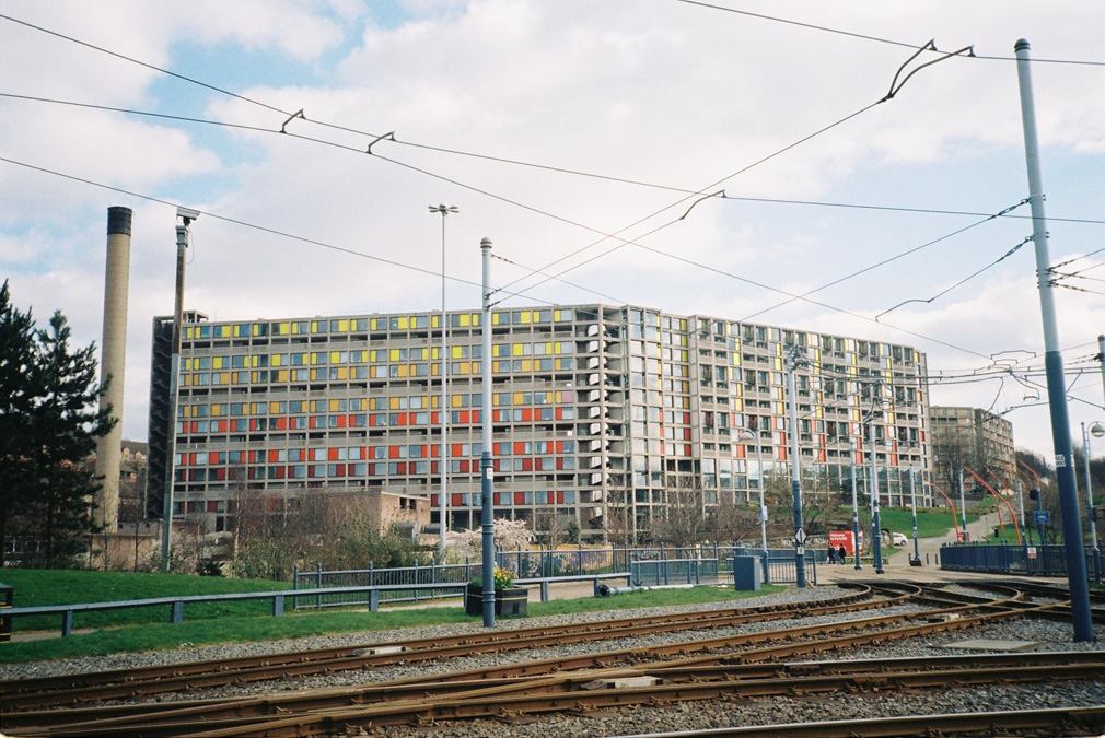
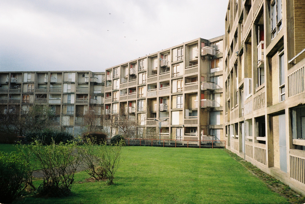
Perhaps it spoiled the planned crescendo of my trip that this initial journey brought me into contact with the only thing I knew I wanted to see, the Park Hill Estate.
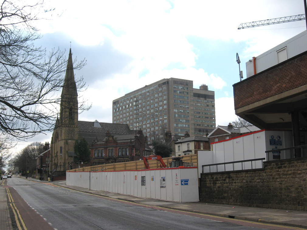
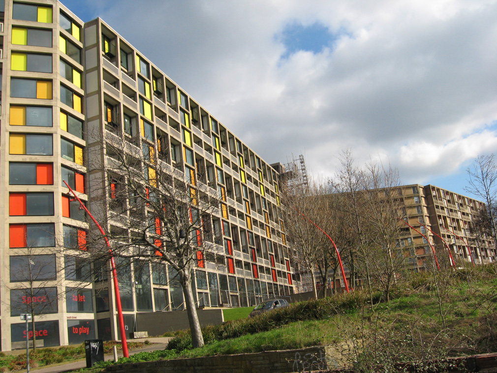
What hit me then about Park Hill was not its enormity but its gentleness (I don’t seem to have done a very good job capturing this in the picture, probably because I missed out the imposing building behind it, which made a much greater dent on the vista). Sliding softly into its surroundings, it made sense that it was there, a light tap on the shoulder in stark contrast to the clunking fist of somewhere like Balfron Tower. It helps that the renovated part faces the city but it’s still amazing what a bit of colour can do (I wonder how much the renovation of Albania’s capital was drawn upon?).
Because I was on a tight schedule I didn’t disembark. I wanted to walk through the city and leave the estate until last, I guess to get a sense of how it fitted into the environment.
Arts Tower
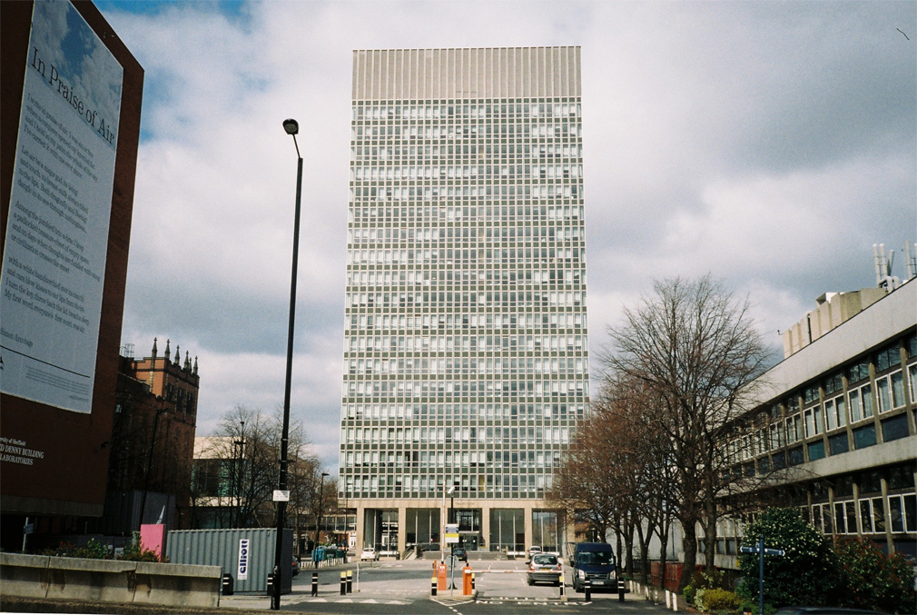
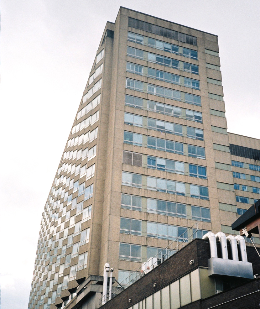
My first stop was the Sheffield University Arts Tower.
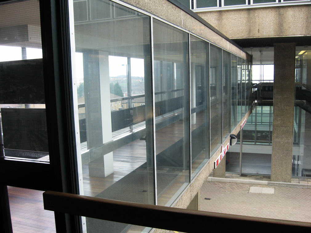
Denied the opportunity to enter the Tower it was sufficient to peer through the windows and shade things in with a few memories. The massive block reminded me of the high school I went to. All the high schools in Exeter were pretty similar, demolished now, and all replaced with a cheap, early-PFI mess, sheds in essence, cladded in the ubiquitous clipped on wood and steel panels that have, predictably, started to look rather rickety ten years after the buildings’ completion. These sorts of buildings also litter the Sheffield campus. I wonder if it’s proving difficult to build them now that so many similarly naff buildings have begun their inevitable decline (nothing ages quite like the recent past!). The Tower also reminded me of my sixth form college, both buildings scraping the sky in cities not short on space, probably a statement of education’s once lofty ambition.
It was quite comforting to see once again the characteristic features of this sort of educational establishment: dust collecting in every corner, exposed concrete, parquet floors all over (can you even get wood that dense anymore?), and the surfaces of the walls, rock-hard and warped by the many layers of clinical, cheap, off-white paint slapped on over the decades (in my woefully inadequate knowledge of paint compounds I would’ve said lead-based given the way it cracks rather than peels, my dad, a chemistry teacher, quickly informed me otherwise). But rather than comforting, the atmosphere itself was chilly. While not helped by the absence of people, buildings like this often seem cold: so solid and sterile and monolithic, speaking a vernacular heavy with words like “comprehensive”, “modern” and “municipal”.
Why would this building never get built now? And why does every new academic building look like an airport? It probably has something to do with the open-day. University is a pretty mainstream thing now and academic buildings have shifted shape to cater for parents instead of professors. These buildings now need to sell a safe establishment image rather than asserting any ideological leanings; what ideological identity remains is deliberately obscured by snack bars and assorted “hubs”. It’s not an ivory tower, it’s a shop. A material impermanence pervades these new buildings, everything is changeable. But it’s funny to think that something as historically “present” as the university is now modelled on the airport, an archetypal non-place defined by its lack of presence.
Royal Hallamshire Hospital
I didn’t have to walk far to find another great monument to state ambition, the Royal Hallamshire Hospital.
The building exudes sturdiness. It’s old but not at all run down, carved out of the hillside as it is. Such a solid structure hardly fills you with confidence its intention is to heal; in somewhere like this patients seem more likely to be institutionalised than made well.
I’m torn by these sorts of buildings (having to walk into one every day for work makes me think about them quite a lot). Really, they’re a microcosm of the NHS: so big and cumbersome and so important to so many people that they’re incredibly difficult to undermine. But despite some sentimentality these buildings are simultaneously overbearing yet increasingly tatty. Once awesome and somewhat terrifying in their projection of state power, now somewhat weakened and vulnerable in the face of a new and much more insidious and impersonal neo-liberal regime, they’re like the dictators of yesteryear, the less awful ones, strong men, sure, but strong men who had a commitment to socialist principles and are still heroes in their own country, Nasser perhaps, or Castro. Maybe I’m getting ahead of myself.
The NHS is okay looked at from a distance but a bit ridiculous as you come up close, the building too. From afar Royal Hallamshire inspired a palpable sense of awe. From up close it’s predictably dull and pretty grim. Wavering for a few minutes I soon carried on down into the centre.
Rubble or Renovated
I passed building after building that reinforced my fast-forming narrative.
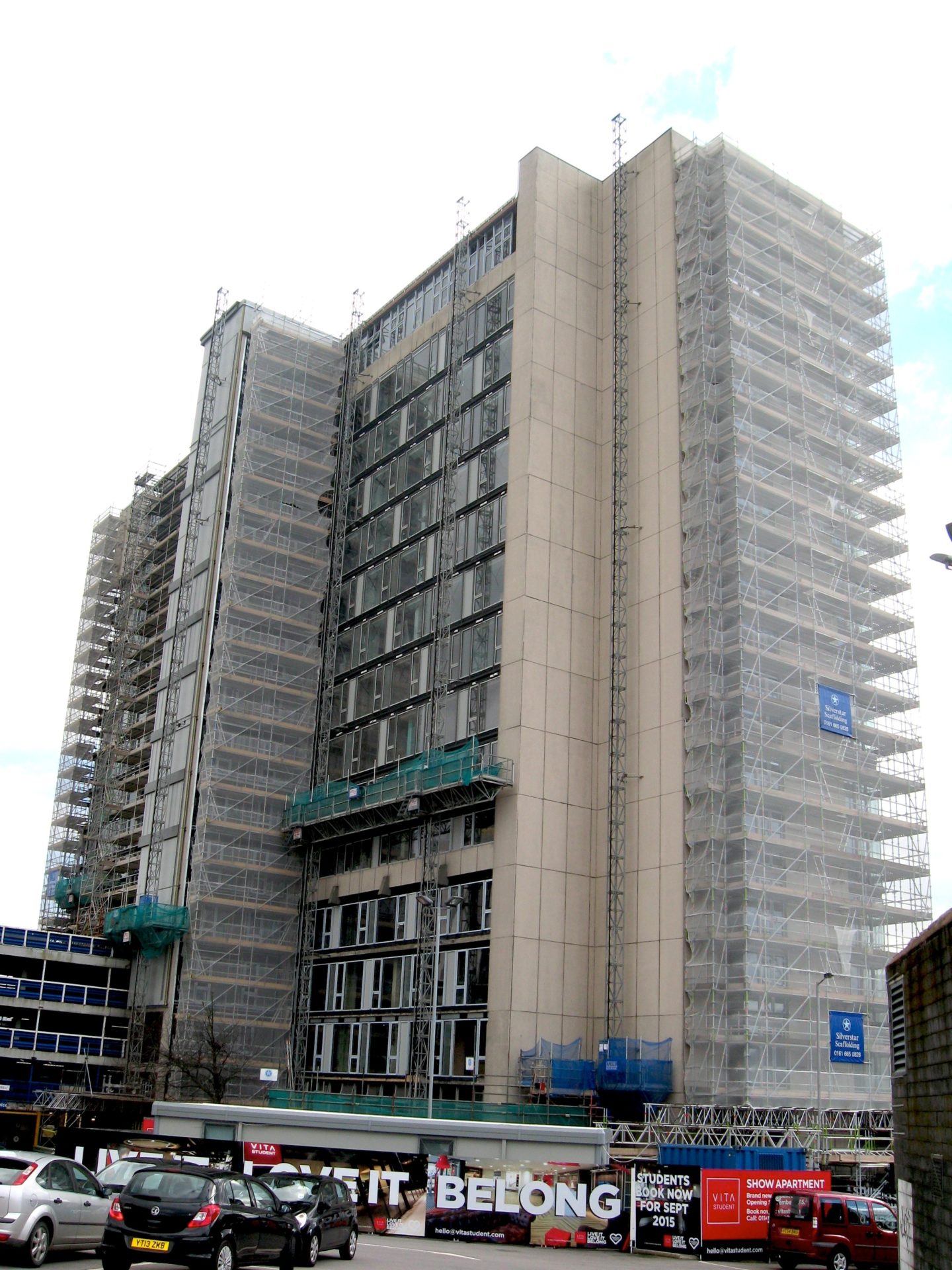
Telephone House has long since dispensed with its original use as offices for British Telecom (the clue’s in the name). With its central location where better to offer ‘a brand new, stylish studio development designed especially for students’? From redevelopments like this you see the warm liquid profit discharging all over the face of Sheffield’s lovely centre. Live It, Love It, Belong. All of a sudden I’m in Southwark. There’s no fucking way you’re going to “belong” in somewhere this awful. If it ever was public, nothing about it still is. For the love of God there are penthouse apartments! What student needs or ever deserves a penthouse apartment?
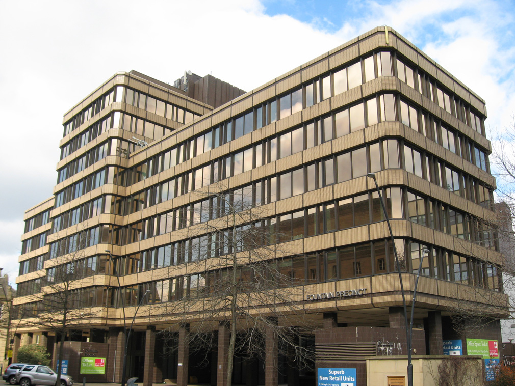
I kept going and relaxed a little bit as I walked along a pretty pleasant high street. I spotted the Fountain Precinct, former National Union of Miners offices. Assertive, ceramic brutalism from the 1970s, mostly empty, who needs unions anymore? Not to worry, there’s planning permission for a 24 hour casino to fill the void.
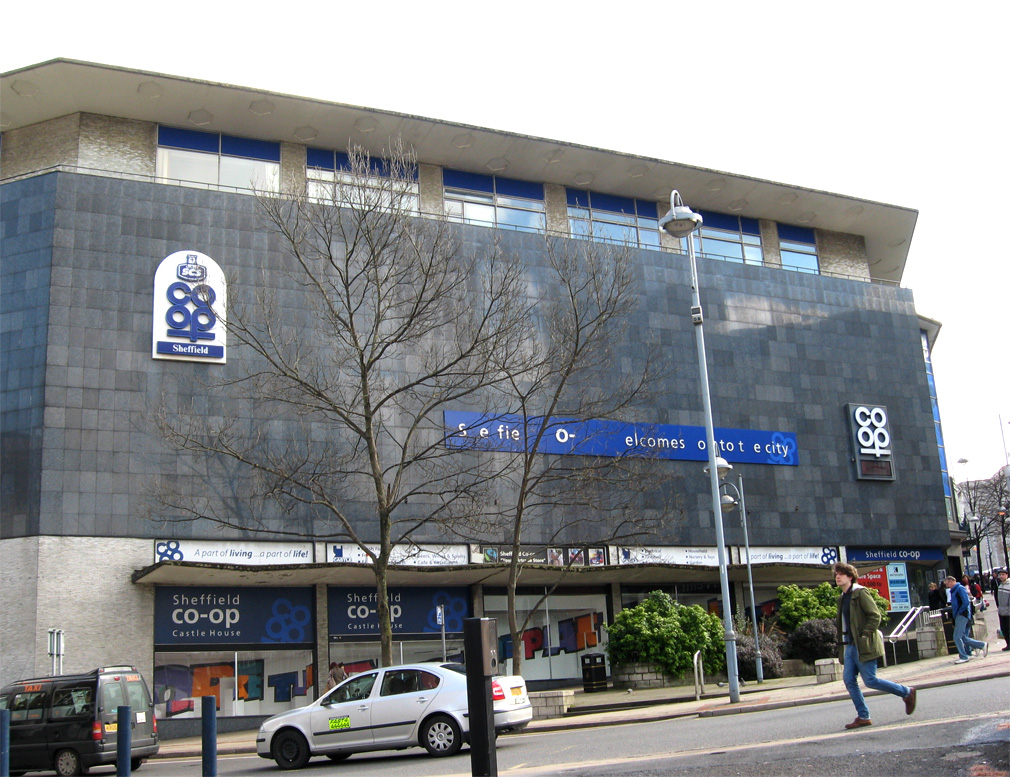
And then the Co-op, with a name like that of course the letters are falling off the building’s front sign. It now makes for a pretty incoherent welcome. I’m guessing that’s Sheffield and not Sellafield, though that would be apt following the recent meltdown of Co-operative’s banking arm.
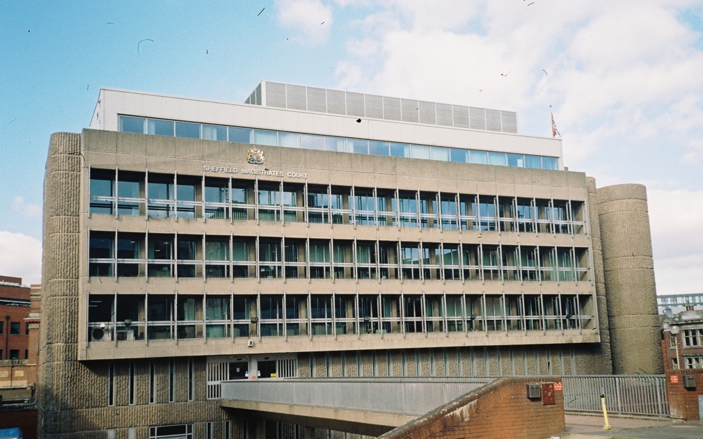
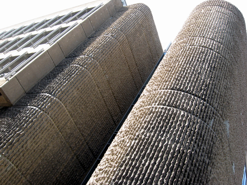
I then proceeded down a hill to find the gorgeous brutalist magistrate’s court. This will remain standing for two reasons: it’s hard for profit to displace the law and it’s just too darn nice.
I’ll just dwell on the latter reason for a moment. Because look! Look how lovely this building is!
Don’t you just want to stroke it! The ribbed texture of the concrete surpasses the Barbican, no question. It’s just so captivating. Brutalism had the right idea; maybe the architects knew that the buildings and the services they housed would one day be at risk and so they built it raw and solid and beautiful (if only that was enough to stop the wrecking ball).
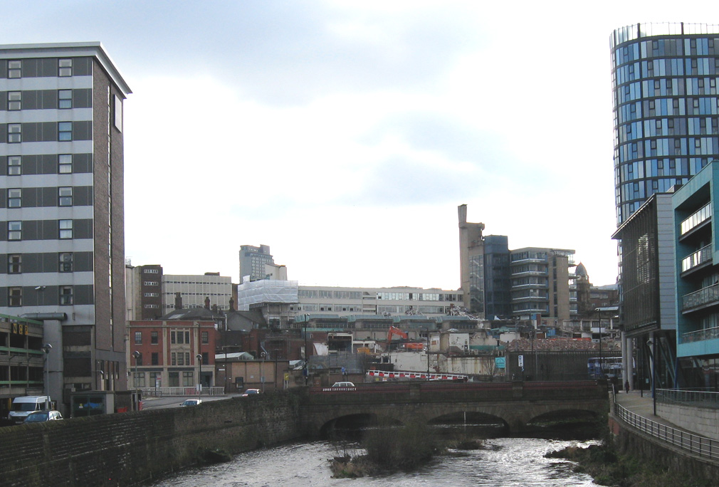
I almost forgot why I was here in the first place as I crossed the river Don to find a wonderful view of a hillside scarred by various recently demolished buildings.
It seemed to sum up something about what‘s going on in Sheffield: slowly but surely buildings are being demolished or remodelled beyond recognition in the pursuit of short-term profit. Why? To paraphrase Marxist geographer Neil Smith, they’re demolished because there’s too great a gap between the value of the land given its present use and the potential ground rent that might be gleaned under a “higher and better use” (and lord knows you can get more money from student flats than you can from the Co-op!). The only community- or socially-oriented buildings that are completely safe from this are those serving a function still within the remit of a fast-retracting public sphere or those whose bombastic ambition has forced aesthetic and historic concerns to overcome the creeping tentacles of speculation. But what’s demolished is never replaced with something of the same integrity. Lessons have been learned, never again will there be buildings so nice that they can’t be ripped down in search of a new spatial fix.
Finally I got back to Park Hill…
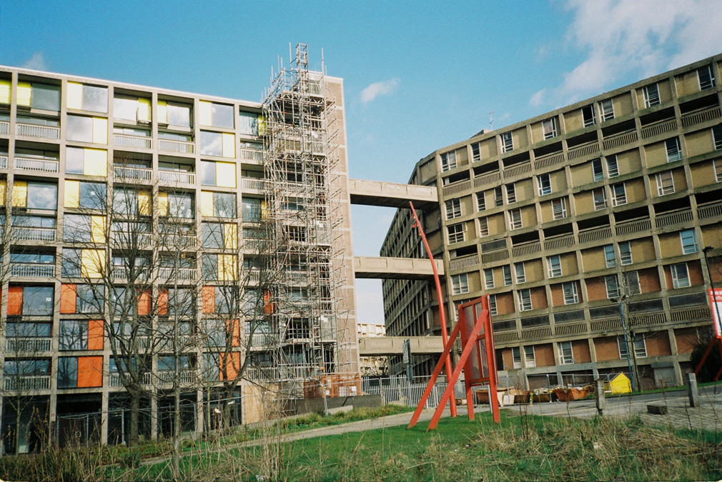
I know they’re gimmicky but as I gazed up from the bottom of the hill the colour panels had a wonderful effect, making the building dance on the horizon. As I approached I could see how clean and well-kept the new parts had become. It’s admirable how much of the brutalism has remained too. This is more or less how much concrete you would’ve seen in the original, and the panels augment rather than distract. All that said this redesign hasn’t quite been able to stretch to all the flats. And those that have been redone don’t seem especially lived in, and nor does the area as a whole feel like it’s thrumming with activity, I was pretty much the only person there. It’s a peculiar thing to behold. On the edge of town, right by the railway station, perched on the top of a hill, it’s remarkably out of place and, as you get up close, very quiet. Away from the renovated parts, I was instantly aware I was indulging in ruin-porn.
The developers of Urban Splash are planning to commence the second phase of redevelopment this year. But this is following a government bailout of the project (to the tune of £39m) and after the company reported an overall loss of £15.4m in the 2011/12 tax year, forcing it to sell its portfolio to its new joint venture partner Places for People. It would be nice to see it happen (even if it is just private flats and businesses) but from where I stood it felt like there wouldn’t even be enough of these customers to make a complete rejuvenation commercially viable. It’s a pretty good measure of how far such redevelopment can go in a town like Sheffield: around a third of the way needed to bring the whole thing to life again. It really synthesised my overall impression: that the survival of public buildings hangs almost exclusively on the potential to profit from them and not at all on what they can offer to the public at large. This was probably true from the start. In his evaluation of the Park Hill estate Owen Hatherley makes a comparison with the aforementioned Barbican: “the Barbican has always been cleaned and cared for;” in contrast “Park Hill has been left to rot”. The only thing separating these two great monuments to brutalist architecture: one was public and one has always been private.
The public and community-oriented buildings that punctuated my walk were in various states of use. As a newcomer, I didn’t really have a clue, but everything seemed a little in transition. Speculation and private development were on the march but some buildings seemed pretty resilient or peripheral to its offensive manoeuvres. I worry though because, as the only driver of the city’s reproduction, such speculation is completely skewed against the things that most of the city’s inhabitants need. What is needed is a new forward-thinking attitude which harnesses the natural pride and ambition of local people (when given the power to do things for themselves) in order to create buildings that can’t easily be knocked down because they are useful, strong, and beautiful. But enough platitudes, this is unlikely to happen anytime soon.
