It is the story of many cities. High rents drive young individuals out of city centers and toward outer boroughs in search of new opportunities. Rundown neighbourhoods are repurposed into hotbeds of artistic activity and interaction, where vibrant cultural scenes emerge and have a dramatic impact on the physical landscape of a previously neglected area.
This phenomenon is especially relevant to post-industrial areas. Every 19th-century town or city had warehouses, with their sizes and shapes dependent on their functions — to facilitate the movement of large amounts of goods in and out, to accommodate offices, and even to function as showrooms. As traditional manufacturing industries declined in many parts of the United States and across the First World, the conservation of these now-obsolete structures began to pose problems. Neighbourhoods struggled to deal with what were commonly regarded as eyesores. Some individuals, however, went for adaptive reuse of these old buildings. In the course of the never-ending process of urban change, New York City has seen the decline of its industrial zones become a different sort of renaissance for a happy few.
Just as many other post-industrial landscapes, Greenpoint is characterized by a few barely functioning and many non-functioning factories, abandoned warehouses, and contaminated soil and air. However, this Brooklyn neighbourhood burst into the popular consciousness with HBO’s hit show GIRLS, and within the last decade has become a key source of content for cultural production and spatial consumption of new communities and their associated networks.
This urban waterfront area, formerly occupied by poor and lower-middle-class immigrants, is becoming a recreational zone enticing the young and upper-middle-class to lives of refined leisure. From whence springs the capacity to create cultural meaning and value from an area previously reviled as a “no man’s land”? It is an unmistakable and paradoxical phenomenon of recycling and new creation.
From Public Canvas to Private Billboard
Increasing numbers of new boutiques and independent shops opening up in industrial areas are generally considered bellwethers of gentrification and symbols of this revitalization. They are not just displays of wealth and power, but also visual references to the very different lifestyles and cultural self-perceptions of newcomers.
New boutique stores fabricate a problematic aura of authenticity: one that is based on a combination of the industrial legacy of the buildings, and also their owner’s new and distinctive creative aesthetics. The latter is generally applied onto the industrial building’s facades.
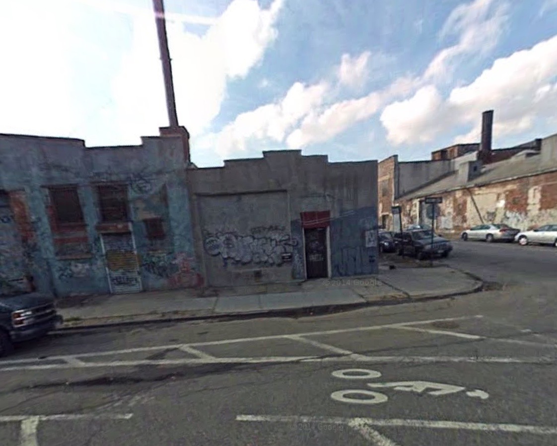
This newness does not spring fully formed like Athena from the head of some Brooklyn Zeus. Outer facades of industrial buildings pose great possibilities, and unconventional art and design elements on retail exteriors emerge from a long history of illegal creative expression such as graffiti. Since the 1970s, artists had used the derelicts such as the Berry Street and West Street area in the neighbourhood as their studio, with building facades as their canvases. By 2007, the entire block was covered with bubble tags, murals, and conceptual pieces.
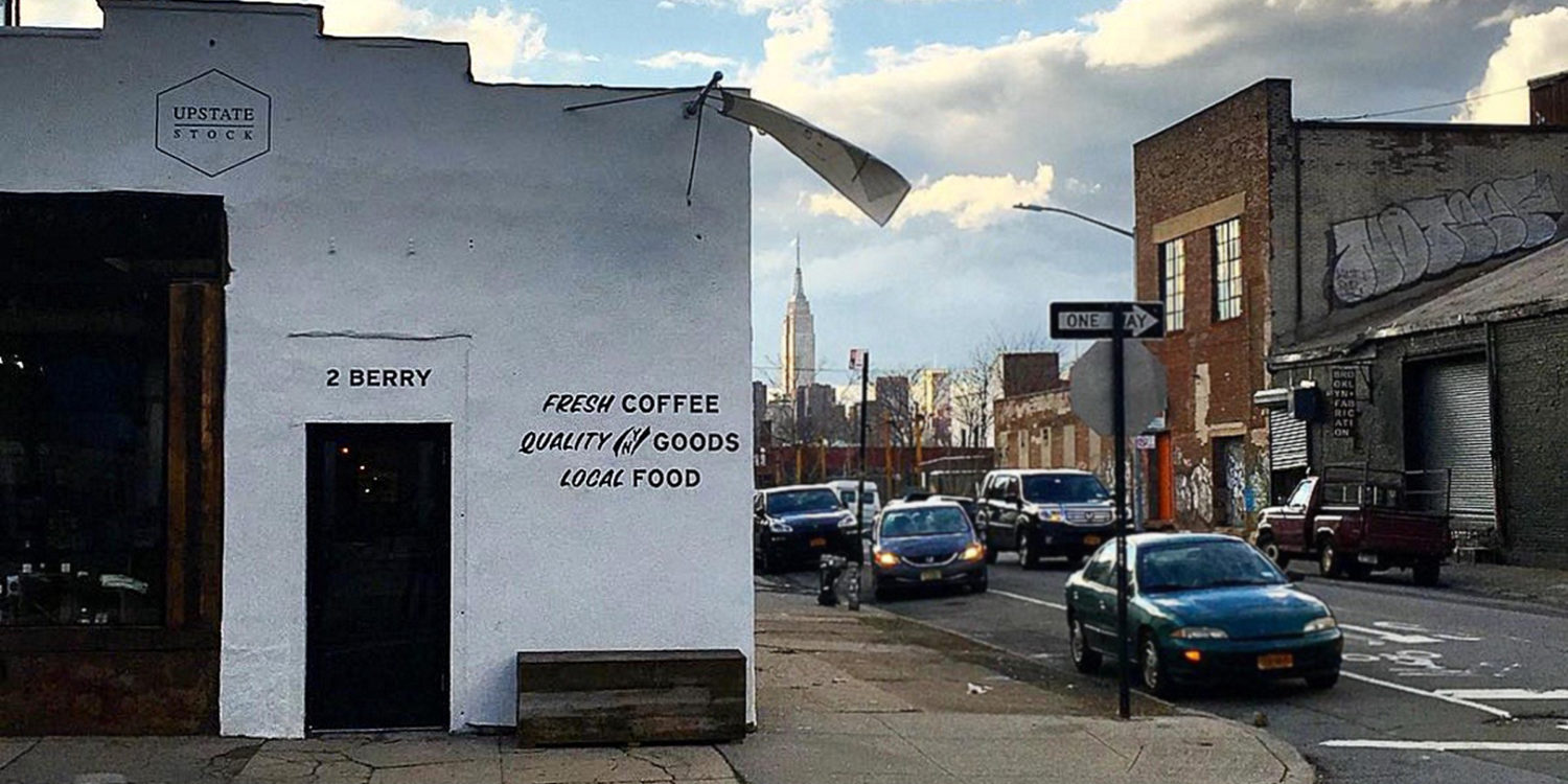
We can trace the beginning of the cycle of revitalization to this significant feature of a creative district’s visual landscape. These early, spontaneous, and often provocative expressions had a true local character. It comes as no surprise that when many abandoned buildings are finally purchased, their exteriors make use of this legacy in their visual transformation – resulting in creations that are one part factory buildings and one part artistic studios. For Upstate Stock, a combination store and coffee shop selling American-made knits and other “quality goods”, the edgy allure of “graffiti-splashed” facades inspired the new store’s owners to integrate street art into the exterior design of the new store. The storefront now poses as an artistic billboard, advertising the qualities that they offer in bright awnings while contrasting with the underlying coat of industrial grime.
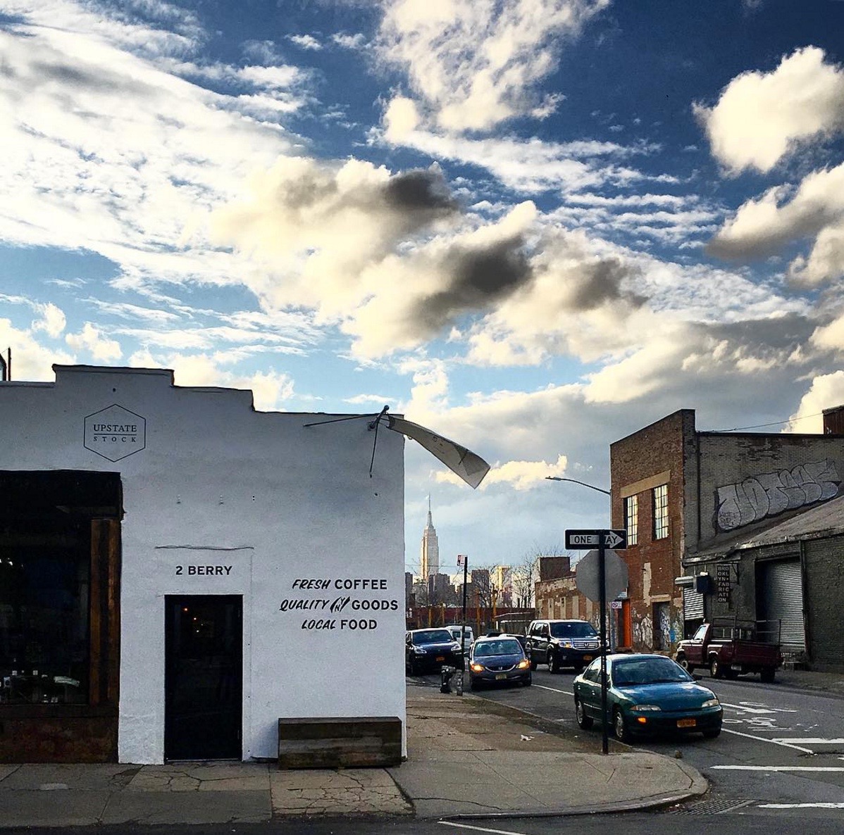
2 Berry Street exterior in 2015.
@upstatestock on Instagram
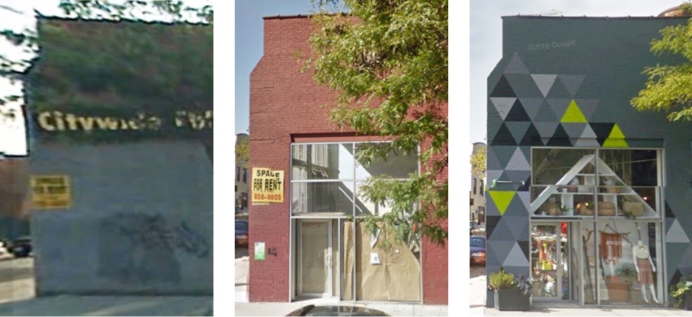
The same is the case for People of 2Morrow at 65 Franklin St., a thrift store offering a curated blend of whimsical vintage clothing, jewelry, home goods, and gifts. The building’s exterior transformed from a rundown exterior with generic store sign into a funky store with a grey, bright green, and black abstract patterned exterior design. Ultimately, this new design seems, regardless of its ultimate meaning, to be deliberately arcane and gnostic-looking. This provides the shop owners and their customers with a sense of being ‘special’, ‘on the inside’, and with ‘knowledge not of the mainstream world’.
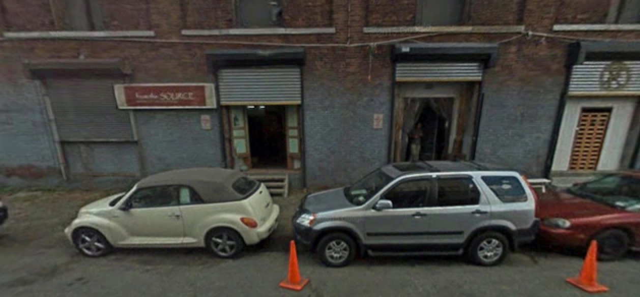
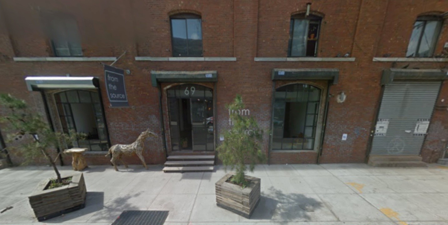
From the Source, an environmentally-oriented artisanal wood furnishings store, is yet another example. In this area that started out as a “dead-zone”, there is a good chance that you will encounter an avant-garde wooden horse sculpture standing outside of the entrance to an imposing industrial building. This edgy looking space at 69 West St. now embodies the neighbourhood’s growing vitality and pedestrian-friendliness.
Reinvented Grit
“Grittiness” was, by the end of the 1970s, mainly a visual image of urban decay – i.e. abandoned factory buildings, vacant storefronts, and long rows of crumbling brick homes. Its usage in the press and in the media was a solely negative one. Think of the old black-and-white noir movies depicting the alienation of individuals left behind in the urban core as people moved out to the more prosperous and safer suburbs. Or, more vividly in the theme of Hollywood’s “urban jungle” movies, from King Kong (1976) and West Side Story (1962) to The Warriors (1979), and Fort Apache, the Bronx (1981).
When artists fleeing from high Manhattan rents looked for new spaces where they could perform, create, and declare their distinctiveness from the mainstream, these “gritty” areas seemed a logical location. The negative connotations of “gritty” lingered for quite some time, even as artists began to open up spaces for cultural and artistic expression. Nevertheless these artists functioned as an initial frontier to sweep most of the grit and the danger away, but they do not extirpate or deny this history of the neighbourhood. But once a critical mass of artistic gentrification was achieved in these neighbourhoods, they became linked to cultural connoisseurship and a rhetoric of growth and revitalization rather than decay.
And so, new Greenpoint boutiques embody this transformation. Indeed, 2016 seems a long way from the days of heavy industry, but as long as a patina of grit remains, customers can faintly hear the roaring of steam engines. Store owners might camouflage some of the outer historical features of a building, while burnishing up certain other ‘desirable’ features. The 20th century modern industrial spirit of industrial building design is still visible in the clean lines and aversion to ornamentation not associated with structural elements. These elements express the industrial era’s assumed aura of simplicity and lack of pretense. Additionally, walls are often painted over white, making formerly dark places feel more spacious and airy. Designers also clearly aim at a rustic vibe by restoring the original wooden or concrete flooring.
The owners of Upstate Stock even polished up an old valve mechanism that services the sprinkler systems of the entire block. They call the 1946 Mass sprinkler, from the Hersey Manufacturing Co. of Boston, “Big Bertha”. “Big Bertha” is a symbol of industry and a gritty traditional working-class lifestyle or environment that is in many ways the opposite of contemporary Brooklyn. A humble, working object is presented on a grand pedestal for display to the authenticity longing public. The light from the windows highlights the shining, polished “Big Bertha” device. Ironically, the steam-age device is located directly next to the coffee counter, where a modern electronic coffee machine and a digital iPod are placed.
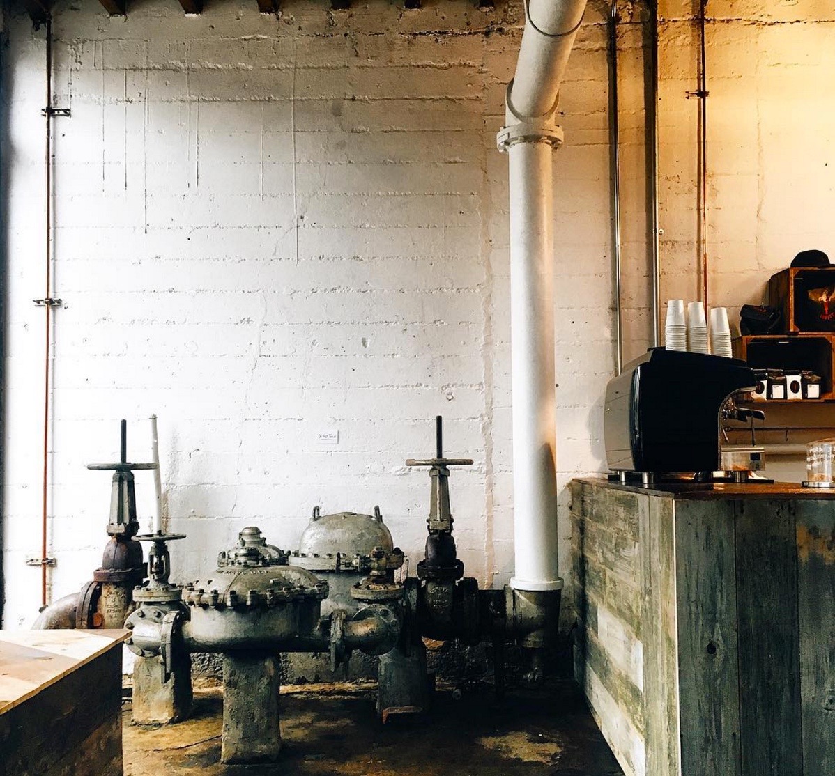
Valve mechanism ‘Big Bertha’ in Upstate Stock.
@upstatestock on Instagram
Authenticity arises when the romanticising of dirty, uncontrolled spaces finds expression in historic layers of the buildings. There is a total inversion of aesthetic value — an act of transformation has turned junk like an old steam valve into a valued item. While any actual physical danger of industrial spaces is of course removed, the aesthetic of implied danger is utilized as a marketing tool. Grit has become rather symbolic of a broader idea of uncontrolled or authority-free spaces as opposed to the supermodernity characterizing the other side of the East River. Given the local history of Greenpoint as a wild and abandoned place, such imagery offers a way for shop owners and visitors to create their own narrative or back story for the visual appearance of the stores.
Authenticity as Novelty
The result is an area that became praised for its honest, spontaneous, and authentic character and aesthetic qualities – a desirable zone of underground energy and creative culture. It remains at one level an alternative to derided traditional Upper West and Upper East Side bourgeoisie wealth, while paradoxically driving cultural consumption and thus real estate development in previously working-class neighbourhoods.
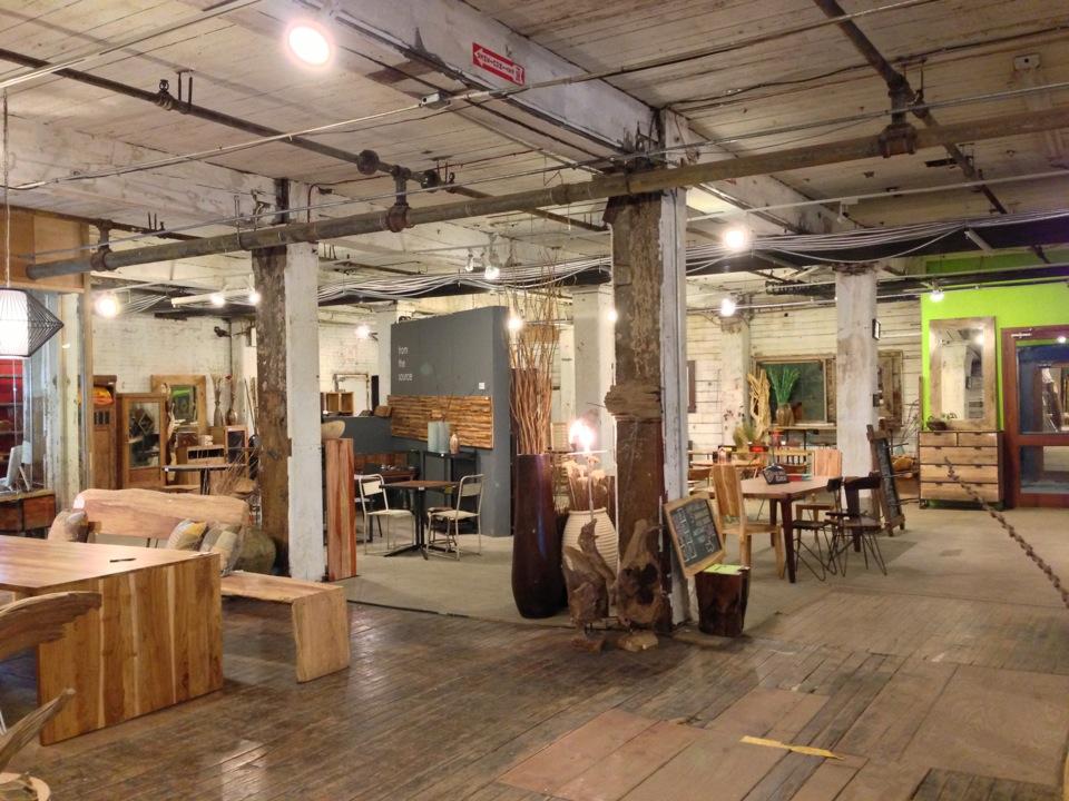
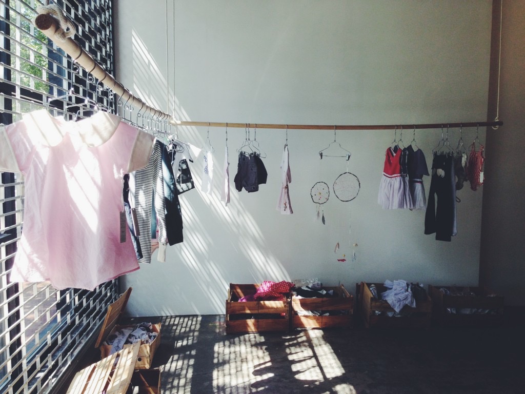
Other examples of such stores are Wovenplay, a boutique selling children’s clothing made of hand-crafted textiles and natural materials, and the earlier mentioned From the Source. Here, the lingering grittiness of the space, in combination with the high-end hand-crafted products is akin to the aesthetic of gentrifiers detected earlier at Upstate Stock. From the Source recalls the lifestyle of the first-wave gentrifiers (artist squatters) through these qualities. The gritty, working-class industrial appearance helps sell such luxurious items as a $5000 bed frame carved from a single log. In Wovenplay, structures built according to a purely utilitarian industrial ethos now function as theatre stage for the promotion of theatrical couture for children and minimalistic dollhouses for nearly 300 dollars.
Late nineteenth century observer Henry van de Velde wrote once that the beauty created by an engineer arises from the fact that he is not conscious about its creation, as opposed to the deliberate beauty created by artists and architects. Now, however, these buildings, far from being employed for purely functional considerations, have become symbols for marketing and branding in a new, capitalist, and commodified world. In a way, these structures are the pale ghosts of things as they were when capitalism began to be established.
A Cohesive Hodgepodge
Rather than representing authenticity, these stores become part of a narrative that comes down to people’s claim on space. The original qualities of these buildings, praised for their honesty and authentic character, then linked to the spontaneous character of underground and creative culture, have now been wholly appropriated and stripped of the antisocial, counter-cultural and anti-capitalist qualities that these groups embodied. From an entrepreneurial drive, gentrifiers have constructed their own willed marginalization from mainstream consumer culture.
The interpretation of industrial interior features suggests new ways of thinking about the reconstruction of post-industrial urban spaces. Through repeated communication, urban spaces are infused with new meaning. Or, by repeatedly expressing and representing the broadly shared negative conceptions of a place in order to differentiate one’s self from others, people are encouraged to re-imagine a place as something better than it was initially thought to be.
A polished version that is – of inexpensive materials, structural articulations, and limited use of ornament – all part of engineer’s practical solutions for the problems at hand. They are now explicitly highlighted as ends unto themselves. The ethos of the industrial city has been turned into an aesthetic of “authentic” beauty.
It is the historical nostalgia and desire for “honesty” that sets the gentrifiers’ lifestyles apart from those of Manhattan and all that is culturally marked as “inauthentic” on the other side of the East River, such as luxury high-rises that grow taller every year and dense crowds of business professionals going through their daily routines. However, we have to keep in mind that the burnishing of authenticity is as much aesthetic or artistic expression as it is a marketing tool. In the end, both consumers and shop owners are united in their consumption of authenticity.
