“I am a total addict of ArchDaily by now, and look several times a day when I can, and forward the link to everyone I know.” (What Architects say about ArchDaily)
Just like some people need a cigarette in the morning or that first cup of coffee, I also have my little daily sin. Almost without exception I visit an architectural blog of which I know its contents are rather superficial. Every morning, I scroll through the most visited architectural website in the world: ArchDaily.
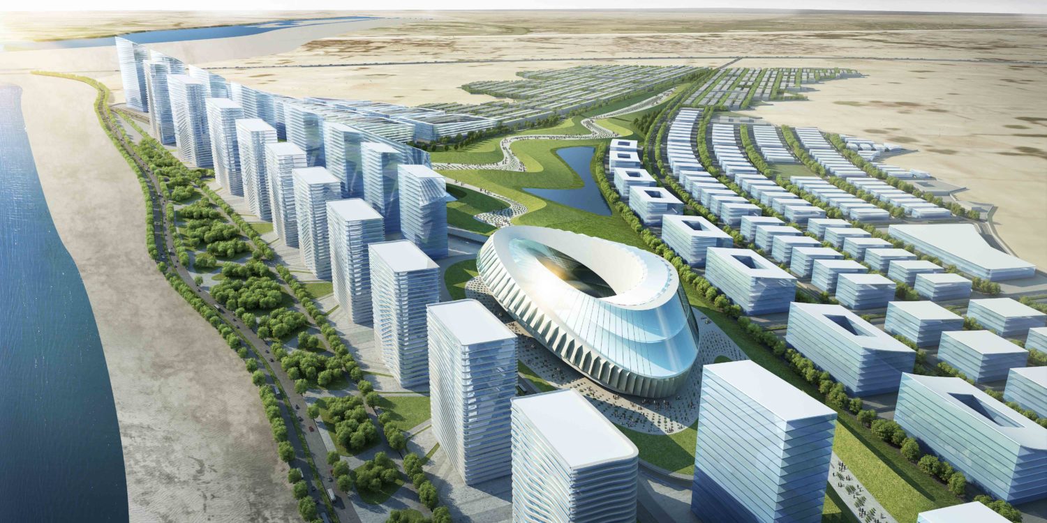
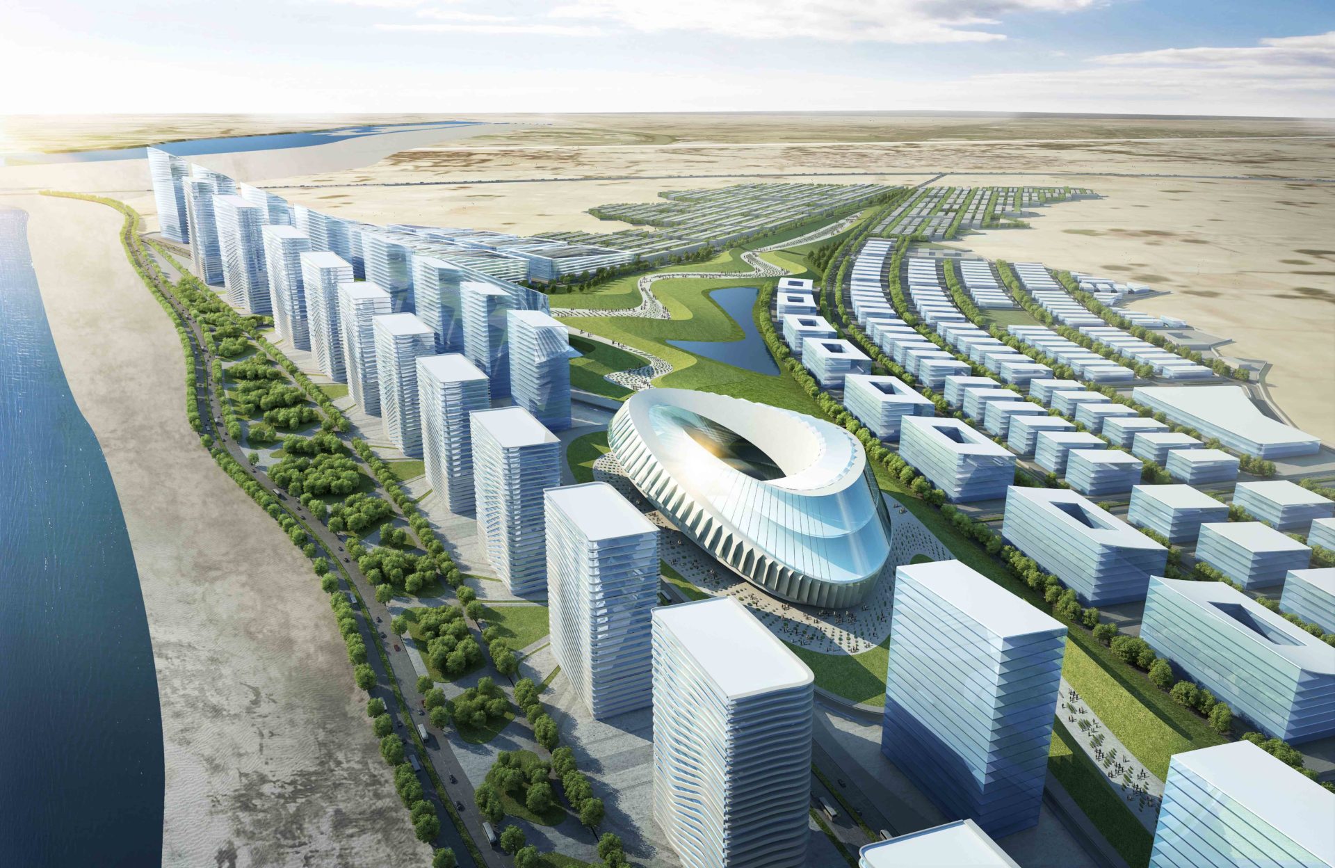
It’s fascinating that a website that mainly seems to publish project descriptions without any editing, straight from the architect’s press release, could become so big. Fascinating, but dangerous as well. For example, when a questionable proposal for a multi-million tabula rasa project in India (see above) is presented as heaven on earth. I’m sure ArchDaily publishes these flashy renderings with good intentions, but all too often the website seems to be literally presenting the architectural office’s promo-talk about social engagement, sustainability and whatever else is on their standard sweet-talk list. Any critical attitude seems absent. Maybe this shouldn’t come as a surprise, since one of the selling points of ArchDaily is its publishing frequency. Every time we check out the website, there has to be something new.
As long as ArchDaily’s readers aren’t thinking that the website solely presents ‘good’ architecture or believe that the accompanying texts reflect an argued critical opinion of its editors, the website has its value too. Rather than best practices, we should perceive the renderings and project descriptions as a representation of the current status of contemporary mainstream architecture. That is why I throw a glance at ArchDaily every morning: to gaze at the mediocre, glossy, sweet-talked reality of everyday architectural life.
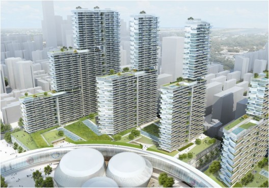
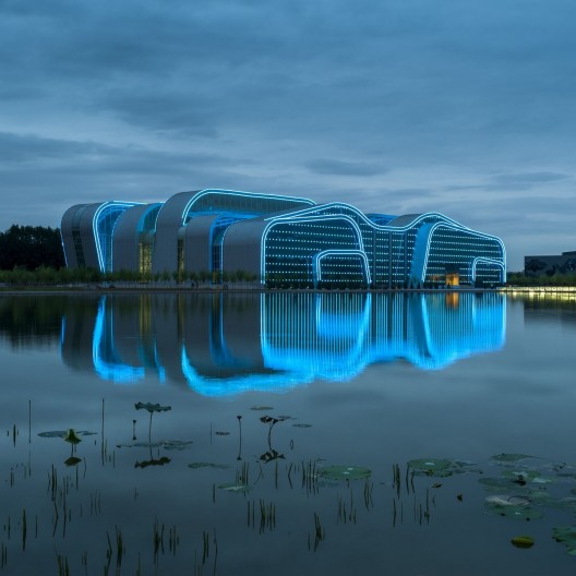
To illustrate my point, I have collected some of my ‘future failure’-gems over the past few months (click here). Besides the unintentional over-representation of Asian cases, there is a striking similarity in the appearance of the renders and their accompanying texts.
Of course ArchDaily is not solely to blame, since they merely publish the architects’ descriptions. The website’s content should be seen as part of a larger trend. Whilst doing research for the exhibition The Banality of Good at last year’s Venice Biennale (by the International New Town Institute and Crimson Architectural Historians), we were similarly amazed by how big international firms like KPF or HOK and large governmental institutions produced the same kind of a-critical design, glossy imagery and sweet texts to sell cities built from scratch that should house millions of people in the near future (‘City in a Box’, Volume#34).
Not only do project descriptions like these erode the meaning of words like ‘sustainable’ and ‘public space’, it also raises a profound doubt about the quality and diversity of the proposed schemes. Somehow you can’t help the feeling that too many of those projects were planned in a rush: by one project leader, six interns and a render firm.
Today, the pace at which buildings are designed in large parts of the world shows us that old design methods are not sufficient anymore. This is painfully (and unintentionally) illustrated by the beautiful film The Human Scale on the work of Jan Gehl. In the film designers working for Gehl in Dhaka talk about analysing small-scale interactions around one pedestrian route over a prolonged period of time, which would enable them to improve the route by very precise interventions. The same documentary however also mentions Dhaka’s extreme growth in population numbers, averaging at 500.000 new residents per year.
I am a big fan of the work and methods of Gehl, but to accommodate this kind of growth we will have to search for new and faster ways of designing, while trying to maintain a maximum amount of quality, diversity and local influence. The similarity in the flashy renderings reproduced on websites like ArchDaily demonstrate that there is still a long way to go. It’s my conviction that the lion share of these plans won’t be able to fulfil their bombastic promises when one would compare the project descriptions to reality after completion.
In the meantime, while trying to figure out how to do things better in the future, I can only advice you to give ArchDaily your morning minute. Just to see what’s out there. As long as you remember to spend the next half hour reading a good newspaper and more critical blogs, learning about what is really important in the world.


